Kevin Leong-Pelrine

Scaling design for merging startups

Building the Pixlee TurnTo Design System

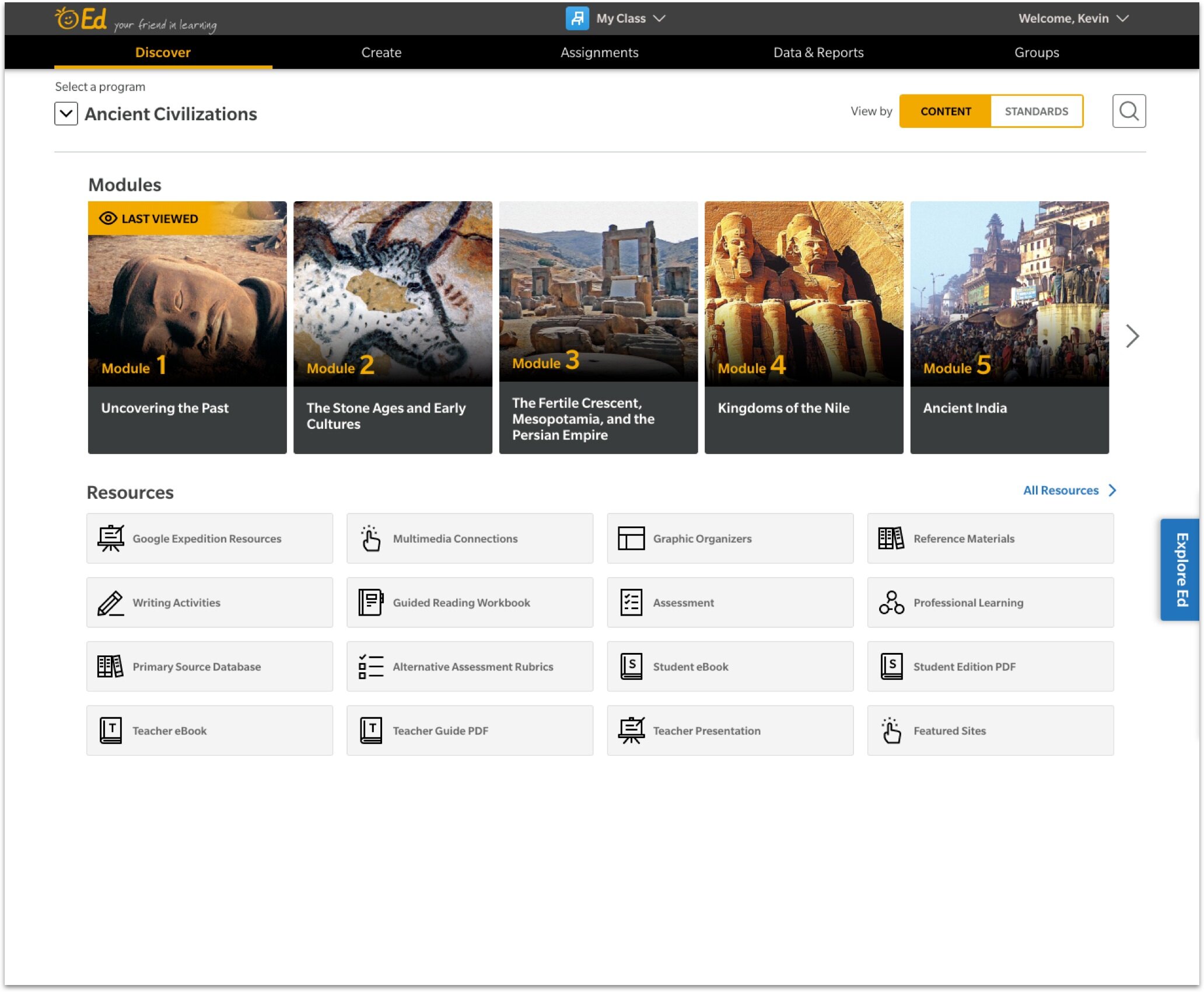
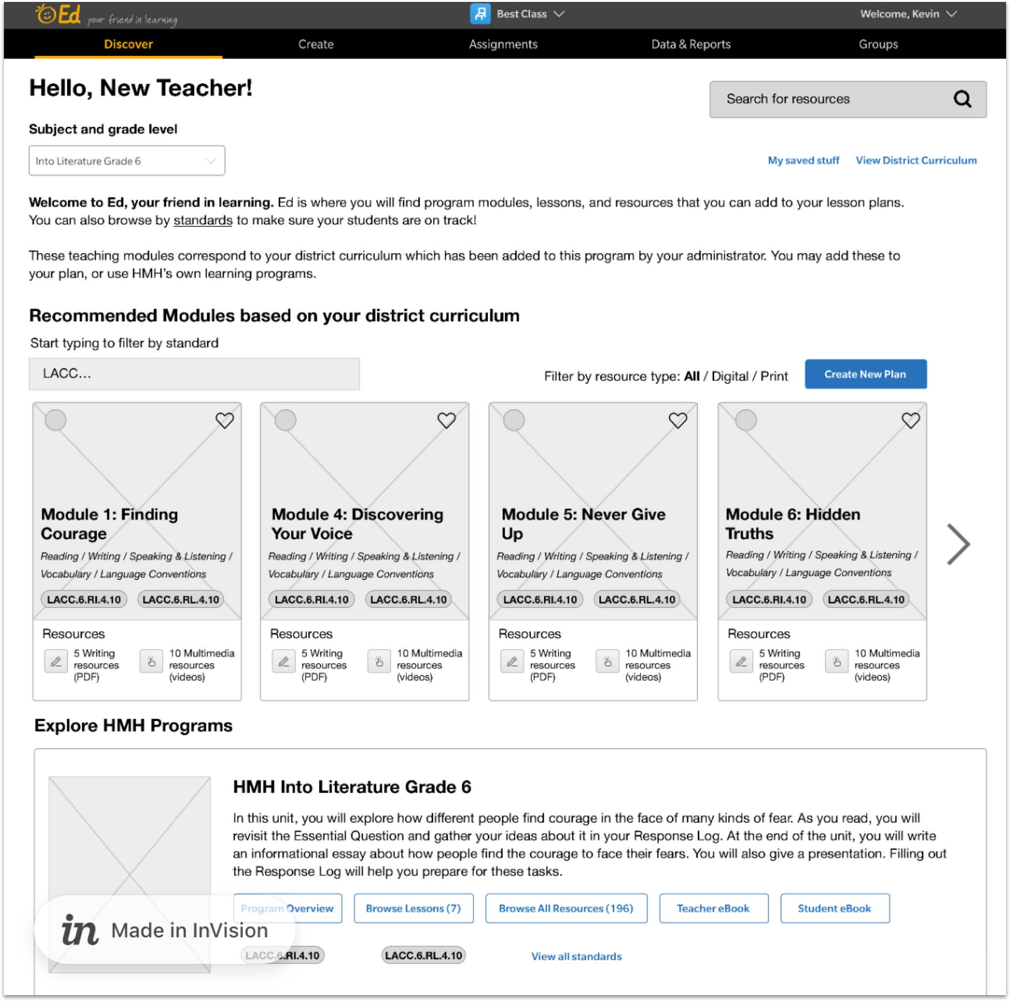
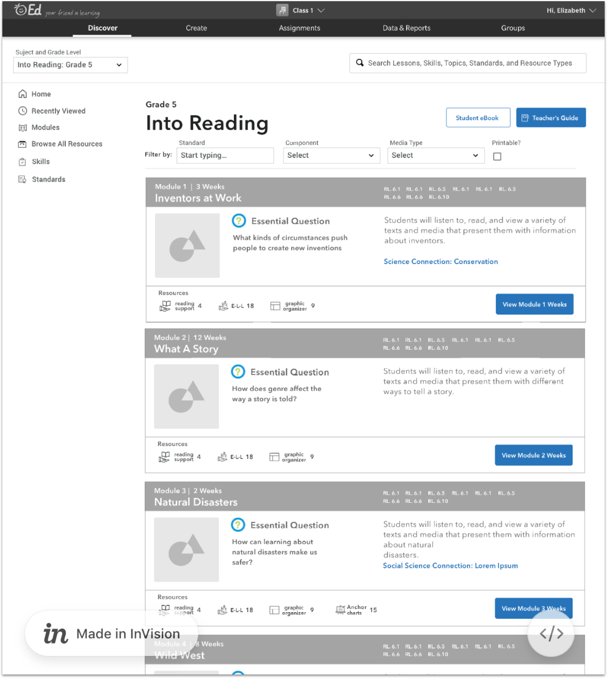
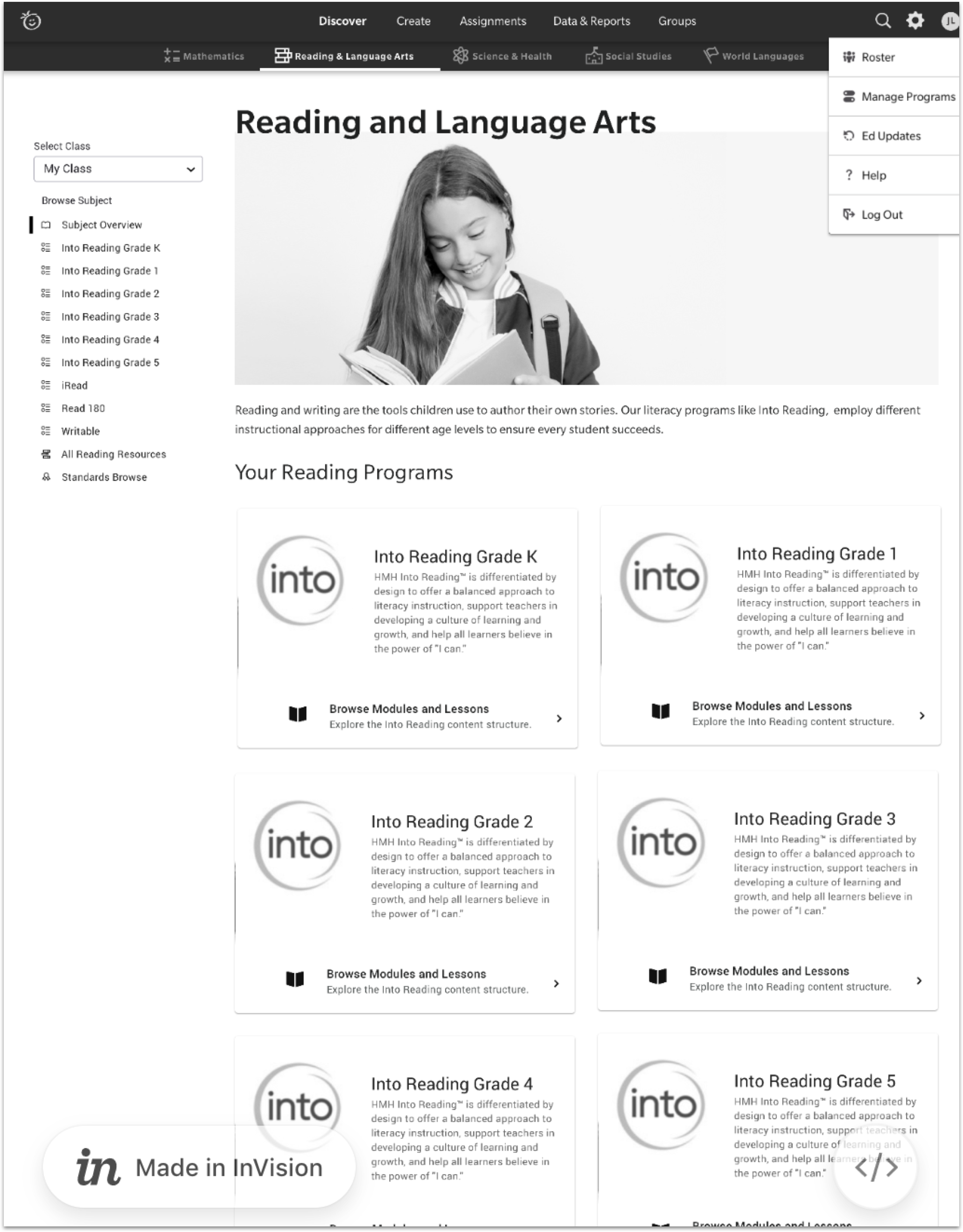
Overview and some background

In May 2020, I was hired at TurnTo as their sole product designer. TurnTo did not have a design system at the time. In December 2020, TurnTo merged with Pixlee to form Pixlee TurnTo, combining the best of TurnTo’s text-based reviews and Q&A with Pixlee’s visual content and social media partnerships. My counterpart at Pixlee, had spent her three year tenure creating a nascent design system with a library in Adobe XD, documentation in InVision and in their own design system site.

With the combination and subsequent scaling up of our design teams, we were ready to re-evaluate our tools and component library to meet the needs of our new team.

Phase One Q1 2022:

  • Switching tools from Adobe XD to Figma to better accommodate collaboration for our distributed team.

  • Recreate all components and page templates in Figma, using modern best practices of variants and properties.

  • Work in parallel with engineers on the Pixlee Blox web components project. (more on that later).

Challenges

  • Figma does not support Adobe XD import, so we had to re-draw every component. The upside to this was that we were able to create components with proper variants and properties.

  • Time. As with any design systems project that does not have its own dedicated team, we are doing this work alongside regular product feature work.

  • Thankfully we did not have to make a hard sell on our design system. Product leadership understands the value of a design system as it supports scaling of the two products overall. That said, our team has had to meticulously track our work; acting as our own project managers throughout the first phase.

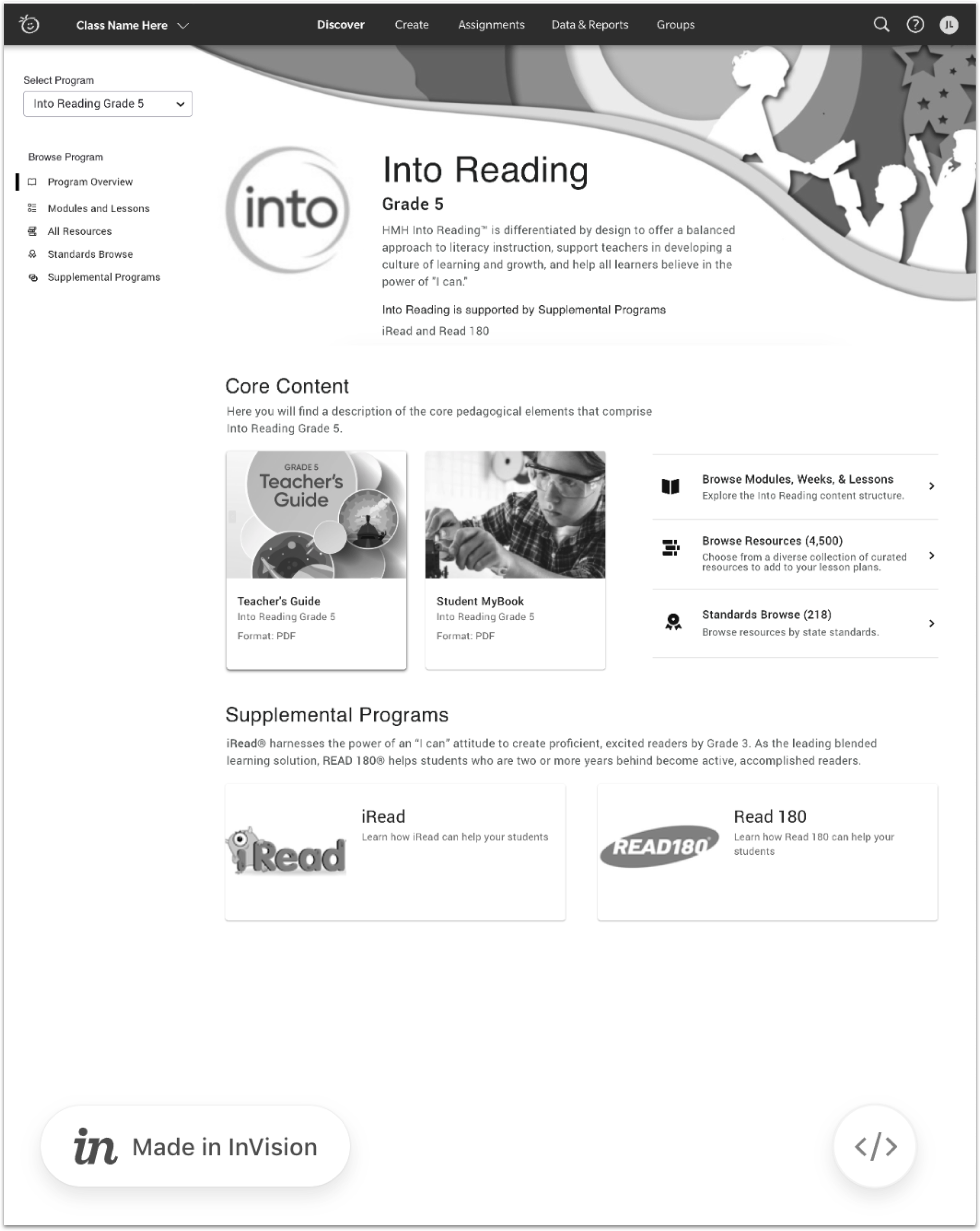
  • TurnTo’s architecture uses in-line CSS, making a “simple” UI re-skinning impractical and tedious. For now, this design system is only focused on Pixlee UI.

Blox: Documenting the Pixlee TurnTo design system in Storybook

  • Blox is a web component library replacing previous design systems documentation.

  • Single source of truth in Storybook.

  • I work in close collaboration with the lead UX Engineer on design PR reviews (Chromatic), and all documentation.

Phase two and beyond

  • Figma library complete and in use for all design projects going forward.

  • Full implementation of Blox components in production code.

  • Assess current UI and begin a full refresh, as we begin to port more TurnTo features (like Checkout Comments) into the Pixlee control panel.

____________

Company

Pixlee TurnTo

Year

2021

My role

Director, Product Design

The team

3 Product Designers, UXE lead, Head of Design, interns.

The tools

Figma, Adobe XD, InVision, Loom, Storybook, Chromatic.

Responsibilites

Responsible for every stage of the design process from research, ideation, prototyping, high fidelity mockups, and final review.

Work in close collaboration with all product managers, engineers, and customer success managers.

Help guide the design team’s processes and standards.

Current project

Currently the unofficial Design Systems Lead.

Scaling a new design system to meet the needs of two recently merged UGC platforms.

Leading migration of our design library from XD to Figma. Creating components in collaboration with UX engineers.

Other projects

I have been fortunate to be the lead designer on several product features for, from kickoff to launch.

Resigned link tracking and analytics features for our influencer partnership platform, Pixlee for Creators, launched in Dec. 2021.

Internal user research project that helped shape the roadmap for integrating TurnTo products into Pixlee. Our first joint product feature, Checkout Comments, launched in Nov. 2021.

Improved Instagram Business Account Authentication Flow, allowing users to connect multiple Facebook and Instagram business accounts in one flow. Launched in Oct. 2021

Lead designer for TurnTo’s Early Reviewer Incentives. Designed admin set up workflow and email templates. Launched in July 2021.


Helping teachers navigate a new EdTech platform

Redesigning Ed: Your Friend in Learning

Overview and background

I was brought on as a contractor in late 2018 to help redesign the navigation on HMH’s EdTech platform.

Ed is a robust educational platform for teachers and students grades K-12. It is a digital companion to HMH’s print curricula allowing teacher’s to create lesson plans, upload their own content, assign homework, and track students’ progress. For students, it provides a way to access and complete assignments, and access digital versions of their HMH textbooks. 

While Ed provides a way to access the vast world of HMH content, the previous design made it very hard for teachers to find the right resources. Content hierarchy was often unclear, and teachers were often faced with literally thousands of resources for a single subject with no simple way to filter. 

The slides below show the evolution of my designs that we tested. The first image is Ed in its current form, the last shows a new vision of Ed as fully Connected Teaching System that is currently in production.

The tasks

To be successful in our redesign, teachers needed to able to:

  • Easily interpret the site architecture and organizing principles behind a program (e.g. HMH Into Math) without relying solely on search. (*Improving search was not in scope for this project).

  • Clearly distinguish between resources that are core and ancillary

  • Browse content by a number of top-level, meaningful categories (instructional/pedagogical rather than “type”)

  • Easily determine their location on the site

  • Understand the structure of the Discover section

  • Make sense of resource categorization

The approach

Breakdown scenarios into actionable steps to better understand why and not necessarily what we were building. I believe this is a crucial step in the design process. My UX director instilled in us the practice to not “solution-eer” while doing this. A lot of these workshops were done in Miro with our teams in Dublin and Boston.

User testing to validate (or invalidate) the designs. In conjunction with the user testing lead, I conducted many rounds of remote user tests in order to work out the most logical navigation. To make my InVision prototypes as accurate as possible, as well as being able to accommodate a massive amount of content, I had to work very closely with my product owner and the learning architects (subject specialists). Because each subjects’ programs had a slightly different labeling hierarchy, this was a painstaking process, that was nevertheless invaluable to our process.

Workshops with dev leads to understand the limitations of the current system and how it can be optimized to implement the design. (e.g. learning why changing the class switcher would have added a month more to the timeline since it was a legacy feature written in Angular and everything else was written in React.)

Other related projects

Throughout my year-long engagement at HMH, I also worked on Ed-related projects including:

  • Research for a new design system. Though HMH had a robust style guide for their eBooks and marketing materials, there was no design system in place for digital products. I worked closely with two UI designers on researching various best-practices and together we wrote basic guidelines for implementation. Towards the end, I got involved in editing CSS variables that eventually made their way into the baseline code.

  • New on-boarding user flows. As Ed became the Connected Teacher System (CTS), I expanded on a new on-boarding feature that would have added great value to the system. It was unfortunately cut from scope due to time restrictions.

  • UX Skills Lab. One of my favorite side-projects at HMH. For a short time, I co-led a weekly discussion group with the whole distributed UX team. We collectively decided on various topics ranging from paper prototyping to user test moderation to design critique skills. I also started a design ethics book club in which we read and discussed Mike Monteiro’s Ruined by Design.

My Venn diagram from our presentation deck for our new design system. Code name: Carmen. Confidential. Do not distribute.

My Venn diagram from our presentation deck for our new design system. Code name: Carmen. Confidential. Do not distribute.

What we learned

This project was not without challenges and obstacles, not the least of which was having the project take a sudden new turn with the addition of Modernist to our team. Much of the work that we had done was not used, but I feel that our team laid the solid groundwork for the future of Ed.

We also had an unexpected change of UX leadership at a crucial moment in the project that was pretty disruptive. It forced me to make tighter alliances with my product manager and engineering team so that we could stay on schedule and in scope.

During our testing process, I quickly learned that using real content was absolutely crucial, as teachers will read every word on the page. Lorem ipsum would not cut it. The UX writer and I had to work closely to make sure all legacy content and new UX microcopy was accurate and that all labels mapped to the teachers’ mental mode. It made me seriously rethink using dummy text in future projects!

Unfortunately, my contract ended before I could see the project through to the end, but I trust the team will take the new Ed designs to new and exciting places.

____________

Company

Houghton Mifflin Harcourt

Year

2019

My role

Senior UX Designer (contract)

The team

7 engineers (Dublin), 1 product manager, and 1 principal UX (NYC)

Responsibilities

UX audit of current platform

Ran ideation workshops

Wireframes and user flows

InVision prototypes

User testing scripts

Design system research

Led weekly peer-to-peer skills sharing workshops


____________

We went through many explorations in the beginning before finally landing on the design as seen in the final UI.

It should be noted that the entire project was put on hold while a third-party UX consultancy (Modernist) was hired to take the project in a new direction. It was heartening to see that a lot of the work we had done prior to that still made it in the final designs.


____________

Our design system was largely based on Google’s Material Design, which we had adopted as a placeholder.

Design systems are crucial for large scale products as they speed up development cycles and allow designers to focus on the experience instead of the individual UI components.

Getting started is no small task though. Much kudos to our UI designers who did the thankless work of cataloging our hundreds of components.

Designing a proprietary enterprise chat application

Building Ming.le Chat from the ground up

New Ming.le Chat, design concepts 2016. Hosted by Infor. Responsive design. Layout matches mental model of chat applications. Groups and Teammates organized in a way that made sense for the users.

New Ming.le Chat, design concepts 2016. Hosted by Infor. Responsive design. Layout matches mental model of chat applications. Groups and Teammates organized in a way that made sense for the users.

Overview and background

Infor's Ming.le, a "centralized space for collaboration, business process improvement, and contextual analytics" needed to improve their collaboration tool. Adoption of Ming.le as internal social network had been slow except from teams specifically required to use it. Our challenge: increase user adoption with a drastic UX makeover. 

Start at the beginning: user interviews

Ming.le is a vast internal communication, file sharing, and workflow tool used by all Infor employees, but through our survey, we discovered that they overwhelmingly used "Posts" (the Facebook-like news feed). So why weren't they happy with the experience? 

We started with an assumption that users avoided Ming.le because of the clunky UI and inconsistent functionality. In with a series of 11 user interviews, we discovered that our assumptions were correct.

See the research study here

Survey says…people wished Ming.le worked the way they wanted.“Sharing files is hard and cumbersome," they said, and that "searching for people was confusing."“Ming.le should replace all other ways to exchange information…” rather than third-party so…

Survey says…people wished Ming.le worked the way they wanted.

“Sharing files is hard and cumbersome," they said, and that "searching for people was confusing."

“Ming.le should replace all other ways to exchange information…” rather than third-party software like Skype or Slack.

Ming.le circa 2015. Built on Sharepoint. Not responsive web design. Drab UI and Facebook-esque feed layout. As confirmed by our research, "Connections" and "Recommended Groups" were often not understood.

Ming.le circa 2015. Built on Sharepoint. Not responsive web design. Drab UI and Facebook-esque feed layout. As confirmed by our research, "Connections" and "Recommended Groups" were often not understood.

Design concepts

We analyzed the feedback and created a list of requirements and user stories.

Our process included object-oriented design exercises, sketching, and detailed mapping of MVP features. 

We then took our concepts from design to presentation-ready in a matter of weeks, presenting our prototype to the CEO and other executives, receiving full approval. 

My design partner Sam and I spent so many days in a room whiteboarding.

My design partner Sam and I spent so many days in a room whiteboarding.

The process

The process

User testing

After initial designs were complete, I made a working prototype (using UXPin) to test at our annual customer conference, Inforum. Over the course of 3 days, I tested 33 participants from diverse industries, gaining many valuable insights into how we could improve the design.

At our UX Pop-up Lab, Inforum 2016. I have less hair now.

At our UX Pop-up Lab, Inforum 2016. I have less hair now.

Overall improvements to the social experience at Infor

Team and Group Directories:

Through our interviews, we heard that users needed a simple way to look up other teammates, rather than go through the cumbersome Outlook directory. Users had to "connect" with each other (like following on Twitter), even if they were on the same team. In Ming.le Chat, we eliminated having to connect with other users, and made all your groups visible via icons in the left-hand navigation. 

Infor Document Management:

Since we were designing a chat tool specifically for Infor users, we were able integrate Infor Document Management (IDM) into the final design. This one feature would set Ming.le Chat apart from any third-party application, and allow users to collaborate around documents seamlessly. 

Launch

Ming.le Chat was finally launched in 2019. Complexities in the data services required to work with IDM, and other business decisions beyond my control delayed the launch considerably, and I, unfortunately , had left the company and was not able to revel in the completion of this project. A former colleague sent me a screenshot and let me know that it was working as designed!

Ming.le Chat live (beta). 3 years after our final designs, and long after I had left the company, Ming.le launched in 2019. A slightly different design, but the main features are in tact, and people are using it!

Ming.le Chat live (beta). 3 years after our final designs, and long after I had left the company, Ming.le launched in 2019. A slightly different design, but the main features are in tact, and people are using it!

____________

Company

Infor / Hook & Loop

Year

2016

My role

Senior UX Designer

The team

2 other UX/UI designers, 1 product manager, in collaboration with Ming.le product owners

Responsibilities

User research

Concept ideation

Wireframes

User flows

Prototype (UX Pin)

User testing - remote and in-person

Executive presentation


____________

In our interviews with Infor employees, several recurring themes emerged:

  • The UI was dull and uninviting. It felt outdated.

  • Having to manually connect to your teammates was a barrier to communication.

  • Confusion about the usefulness of “Recommended Groups” and “Recommended Users".” Why were they recommended?

  • Search did not retrieve relevant results.

  • The general lack of engagement gave the impression that Ming.le was abandoned. Skype or Slack was quicker.


____________

The design process was extremely collaborative. Most whiteboard sessions were between myself and one other UX/UI designer, with support from our technical product manager.

We understood each other’s strengths and delegated tasks accordingly.

I was stronger at research and user testing.

She was stronger at UI and proficient in Adobe XD. Our initial concepts were mocked up and tested very quickly.

Overall, a very gratifying experience and, in my opinion, an example of a project done right.


____________

Hook & Loop wanted to highlight our UX research at their annual conference, and we were able to build a Pop-Up User Testing Lab on the floor of the Javits Center.

Each room was set up with a Mac and recording software (we used Lookback).

Building custom dashboards for Infor customer support

Infor Homepages: The right data, at the right time, for you

Overview and background

Infor’s Homepages are dashboards customized for users, roles, and industries. It was one of the major design updates to Infor's overall UX strategy. Throughout my tenure at Hook & Loop, I helped enforce design standards, wrote guidelines, and did UI design for the dashboard widget (the primary component). 

Implementing Homepage widgets for Infor Concierge

Infor's customer help portal, Infor Xtreme, needed way to display the most relevant information to customers via a collection of widgets on customizable Homepages.

Infor Xtreme is a complex system that caters to many user types. We scheduled two days of discovery research with actual users and discovered Xtreme was not tailored to individual users as well as it should be. We then analyzed the feedback and created a list of requirements and user stories. 

Since our users all required different information to be displayed, we knew this was the perfect use of Homepages because we were able to dynamically tailor dashboards based on users' roles and industry, putting all relevant information front and center in neatly organized widgets.

I realized that to meet the various user needs, each widget had to have its own unique requirements and technical capabilities, so we made use of simple lists, data visualization, complex filtering, and search capabilities.

Infor Xtreme is a complex system to navigate, with layers of tabbed navigation. Much of the relevant information that a user needs are hidden.

Infor Xtreme is a complex system to navigate, with layers of tabbed navigation. Much of the relevant information that a user needs are hidden.

Concierge: the right information, for the right role, at the right time.

Concierge: the right information, for the right role, at the right time.

Implementing Infor’s design system, SOHO

Making company-wide UX and UI updates to a diverse world of enterprise software solutions is no easy task. Our documentation was absolutely key to making these improvements as smooth as possible. 

As part of my overall work on Homepages, I helped craft the UX guidelines for widgets, identifying all the basic components of a widget and organizing them in an easy-to-read format so that product teams could "follow the recipe" in creating their own custom Homepages. This guide is now part of the standard Ming.le SDK used by our developers all over the world. 

My page for the Soho usage guideline

My page for the Soho usage guideline

Infor Concierge making its debut on the main stage at Inforum 2017. Presented by Chief Customer Officer, Mary Trick.

Infor Concierge making its debut on the main stage at Inforum 2017. Presented by Chief Customer Officer, Mary Trick.


____________

Company

Infor / Hook & Loop

Year

2017

My role

Senior UX Designer

The team

I worked closely with the business analyst and several engineers throughout this engagement. The CTO and CCO were very close to this project as well.

Responsibilities

Wireframes

Final UI

Liaison between product teams and the design system team.

A/B testing a new navigation paradigm

Infor Demand Management

Overview and background

The Infor Demand Management was in need of a new navigation paradigm in order to unify its product suite. Our primary goal was to obtain feedback on a new concept for Global Navigation design (left-side rail vs. existing app switcher model). Through testing, we hoped to uncover feedback on ease of use, satisfaction, and efficiency. My colleague and I created two design solutions for a quick A/B test.

Hypotheses and Assumptions

  • Users will recognize the visual signifier of the currently active application.

  • Users will know how to open the app menu from the new design.

  • Users will understand that they can explore another application menu without leaving the current page.

  • Users will mistake the affordance of the hamburger menu, thinking the app switcher may live there.

nav testing.png

Recruiting users with the Infor Beta Testing Community

We recruited participants from Hook & Loop’s Beta Tester Community, emailing 140+ active subscribers and asked them to book a time on the given dates. 

We received 14 sign-ups or roughly 10%. One participant did not show up to the interview, so we had 13 in all. Such is life. 

Most were actual Infor product users (some were Infor partners) in various industries such as retail, financial services, and healthcare.

Our two subtly different prototypes used in the A/B test

Our two subtly different prototypes used in the A/B test

What we learned

New design performed better
Participants in Test A had a much easier time finding the item they were looking for and everyone rated the task overall experience as being easy or very easy.

Hamburger confusion
Although participants in Test B were able to locate the file, they had a harder time understanding how the global and app/hamburger menus worked.

Visibility is everything
Having the available apps, alerts, and profile settings readily available makes them easier to use. It’s a classic case of “Don’t make me think.”

How testing informed the design

Enhanced recognition of icons.
Made the app icons look more like apps/modules rather than the current icons which are often used to represent system users.

Made clicking on app icons to display menus more intuitive.
Some participants were not expecting (at first) to be able to click on the app icons to display the menu.

Explored design solutions to minimize confusion of mistaken affordances.
Modified designs for system tools such as Search and Alerts, as the current method made them look active.

Considered internationalization in design.
Some non-English speakers had to work harder, plus some users worked from right to left so this needed to be taken into consideration.

Provided feedback to other product teams.
There was some great feedback regarding the hamburger icon/application menu and app switcher that could help these teams to advance their own efforts. 

____________

Company

Infor / Hook & Loop

Year

2017

My role

Senior UX Designer

The team

I partnered with another UX designer and our product manager in our Demand Management Pod.

Responsibilities

InVision prototypes

User interviews

User testing moderation

Data collection and analysis

Designing security alerts investigation flows

Resolving alerts through investigative queries for Capsule8

Overview and background

From their website: “Capsule8 is the only company providing high-performance attack protection for Linux production environments – whether containerized, virtualized, or bare-metal. Capsule8 liberates SecOps from managing a high volume of manual tasks, while being safe for even the busiest workloads, on the busiest networks.”

For those lucky enough to understand Linux-based network security terminology, this may make perfect sense, but for a UX designer, it was like learning a new language. In my brief time as the only designer at this startup, I had to learn the dizzyingly complex world of network security fast, and translate that into designs for their client-facing alerts console. It was an absolutely fascinating experience being the only designer on a team of hard-core Linux engineers and I learned a lot.

Alert investigation user flow

Alert investigation user flow

Cap8_demo2.gif
Landing page for investigating an alert

Landing page for investigating an alert

Expanded view of session playback screen

Expanded view of session playback screen

Query side panel open

Query side panel open

Query running

Query running

____________

Company

Capsule8

Year

2018

MY Role

Senior UX Designer (contract, only designer on the team)

The team

I worked primarily with the engineering manager, 2 other full-stack engineers, and the VP of product.

Responsibilities

UX audit of current platform

High level system flows

Wireframes for the alert-to-resolution experience

InVision prototypes

Client interviews on-site with a partner in Virginia


____________

Much of my work in this short engagement focused around high-level explorations of the alert-investigate-query-resolve task flow that a security analyst would undertake on a daily basis.

Most security analysts batch-resolve issues quickly, as most of the alerts are false alarms, or from a node being too sensitive.

My explorations were for that special case when alerts need to be investigated further. This involved needing:

  • Summary of the alert with very specific details (provided to me by the engineering team)

  • Comment log

  • Timeline of events before and after the alert was triggered

  • Video playback of the command line, recorded in real-time.